
Designing for friction: The quiet language of trust in banking
When I joined the bank, I was surprised to learn that the issue keeping the executive team up at night wasn’t profit, or growth, or even the economy. It was fraud.
Even at the branch level, the biggest concern wasn’t sales or customer satisfaction, it was safety. How to protect employees in the event of a robbery. How to make customers feel secure when they walked through the doors.
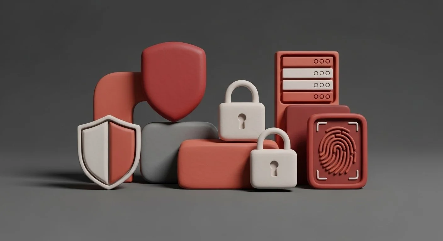
Banks put enormous effort into building that sense of safety, much of it invisible to the average customer. Layers of systems, checks, encryption, alerts, training, monitoring. It’s a fortress most people never see.
In design, friction is how users feel that security. Just like seeing the steel door of a vault signals that your money is safe inside, a moment of friction in a digital experience, a two-step verification, a confirmation prompt, a secure handoff between systems — quietly tells you the same thing. You are protected here.
Friction gets a bad name in design. We’re taught to chase ease, to make every flow faster, smoother, simpler. But in banking, removing too much friction can create a different kind of risk — not for the system, but for the sense of safety people rely on.
When a transaction happens instantly with no pause, it can feel unnerving. Did it go through? Was that secure? Shouldn’t there have been a step between? These are not signs of poor design; they’re signs of human instinct. People need moments that confirm control, that signal caution.
The art is in balance. Too much friction and the experience feels bureaucratic, cold, or outdated. Too little and it feels careless. The right amount is subtle — a brief pause, a confirmation, a clear message that someone is watching out for you.
We learned this firsthand while redesigning the digital application flow for account openings, credit cards, and loans at CIBC. Internally, the project was known as FastApp, built on the promise that customers could apply for a new product in under five minutes. The value proposition was speed — the same frictionless expectations people had grown used to from other digital services.
At launch, the entire application lived on a single page, including personal information, consents, legal terms, and privacy agreements. It looked efficient and tested well in prototypes. But when real users went through it, something unexpected happened. They said it felt too fast.
They weren’t confident they had entered everything correctly. They missed details in the dense layout. The lack of pauses, sections, or review moments made the process feel transactional rather than trustworthy.
After that research, we reframed the experience. Instead of designing for speed, we designed for security. We broke the flow into smaller, focused steps, allowing people to absorb each part of the process. We added a review stage so users could verify their details before submission — a deliberate pause that signaled care.
When we re-tested, the change was clear. Users felt more confident, more in control, and more secure about sharing sensitive financial information. What we lost in seconds, we gained in trust.
Designing for friction is really designing for reassurance. It’s about crafting micro-moments that say, we’ve got this covered. It’s the digital equivalent of the quiet security guard in the corner or the camera above the door — present, but not oppressive.
Over the last decade, digital experiences have trained people to expect effortless flow. Social sign-ins, auto-filled forms, one-click checkouts — everything designed to minimize friction. You can move between devices, apps, and channels without ever stopping to think about what’s happening underneath.
That expectation of seamlessness is now universal. But in a secured bank, it’s also at odds with the reality of what’s required to keep people safe. Banking systems can’t move that fast because they’re not just managing convenience; they’re protecting financial identity.
The same patterns that feel “good” in other digital products can actually feel suspicious in a financial one. If everything moves too easily, users start to wonder: was that secure? did I just move thousands of dollars with a single tap?
Designing for friction is about reconciling those two truths — the need for flow and the need for pause. It’s not about making things harder. It’s about making the right moments visible enough that users feel the strength of the system holding their money.
In a world obsessed with frictionless design, it’s easy to forget that trust often lives in the seams — in the quiet confirmations, the extra checks, the pause that says, we’re making sure this is really you. The best security doesn’t hide behind the curtain. It shows up just enough to remind you it’s there.
Friction, done well, is not resistance. It’s reassurance. And in banking, reassurance is everything.