
CIBC Redesign
Modernizing & consolidating CIBC digital banking at scale
My Role
Design Director — Led product vision, research strategy, design execution, & stakeholder alignment across business, product, & technology.
Team Size
22 people (Design, Research, Content, DesignOps) + 30+ product teams across CIBC.
Tools Used
Figma, Jira, Confluence, Adobe CC, UserTesting.com, Medallia, Tableau
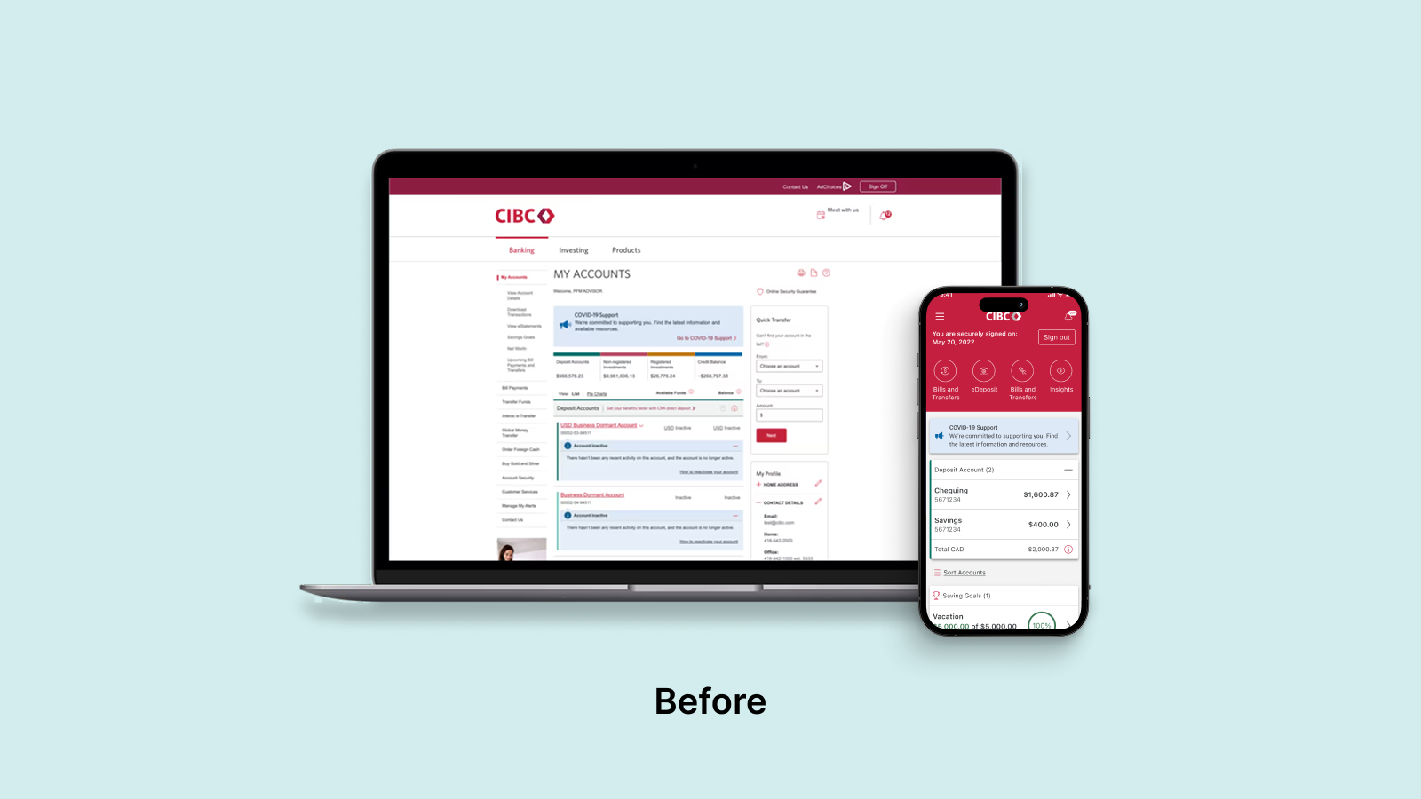
When I joined CIBC, platform fragmentation and accumulated debt had outpaced the bank’s ability to deliver consistent, modern experiences. Teams were moving slowly, rebuilding the same solutions across multiple stacks and struggling to meet customer expectations. This friction led to declining NPS, limited self-service, and increased pressures on call & bank centers. The business was constrained, unable to launch features or scale adoption effectively.
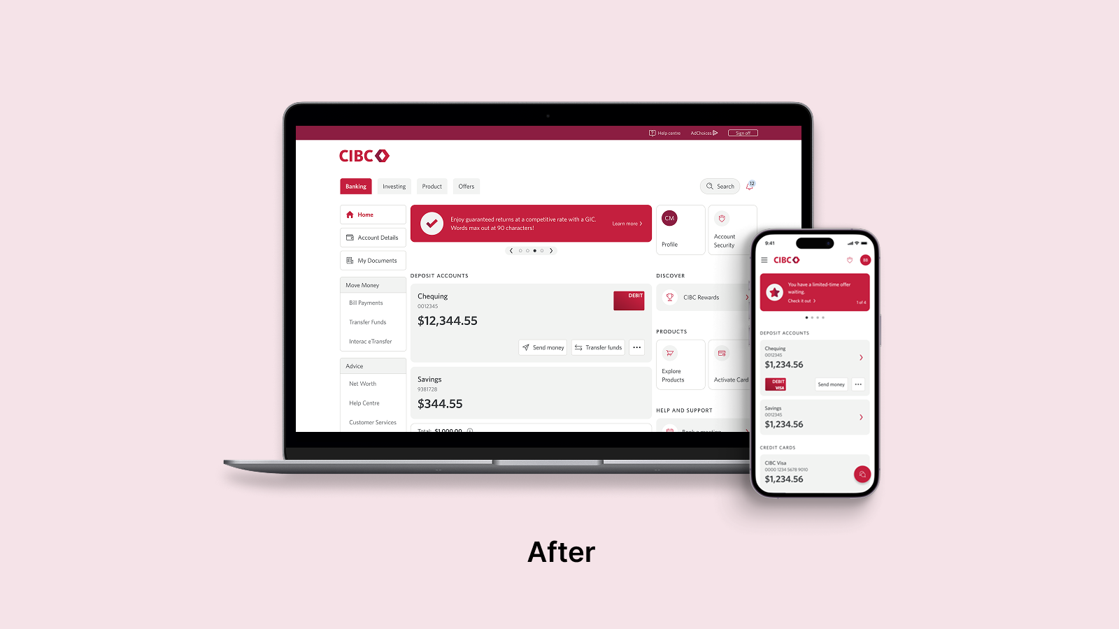
My team and I modernized how the bank shows up for clients while consolidating delivery through the True North design system and a Design Ops practice built from the ground up to align 30+ teams. By shifting from intuition to a strategy grounded in empirical research and behavioral analytics, we elevated design into a core business capability, driving record NPS, measurable conversion gains, and increased delivery velocity.
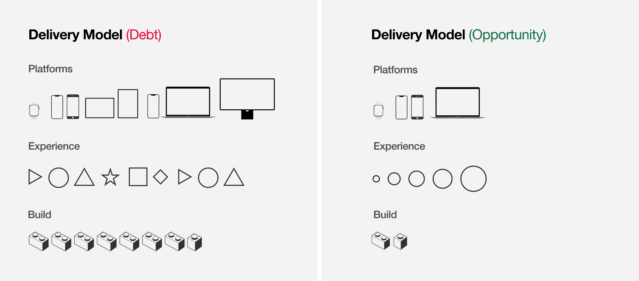
Modernizing the delivery model
The fifteen-year accumulation of technical debt meant each platform required independent builds and bespoke solutions. Teams were recreating patterns and components across disconnected platforms for every release, driving inconsistency and slowing progress. To address this, I partnered with business, engineering, data and product to move from fragmented execution to consolidated build standards shared across platforms. This shift reduced structural complexity, eliminated redundant work, and enabled delivery of a unified experience across the ecosystem.
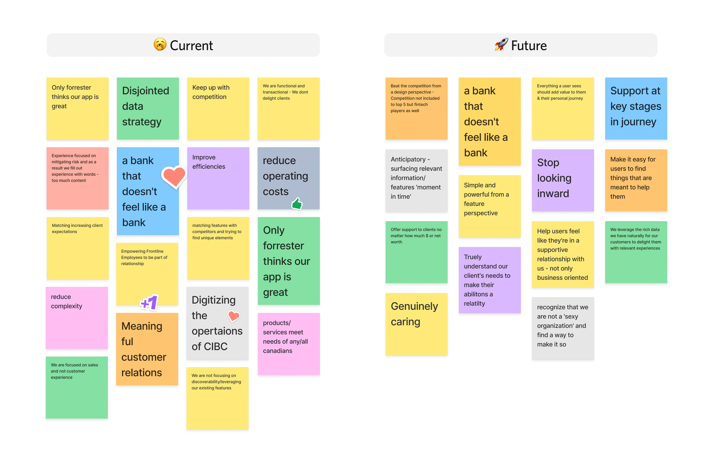
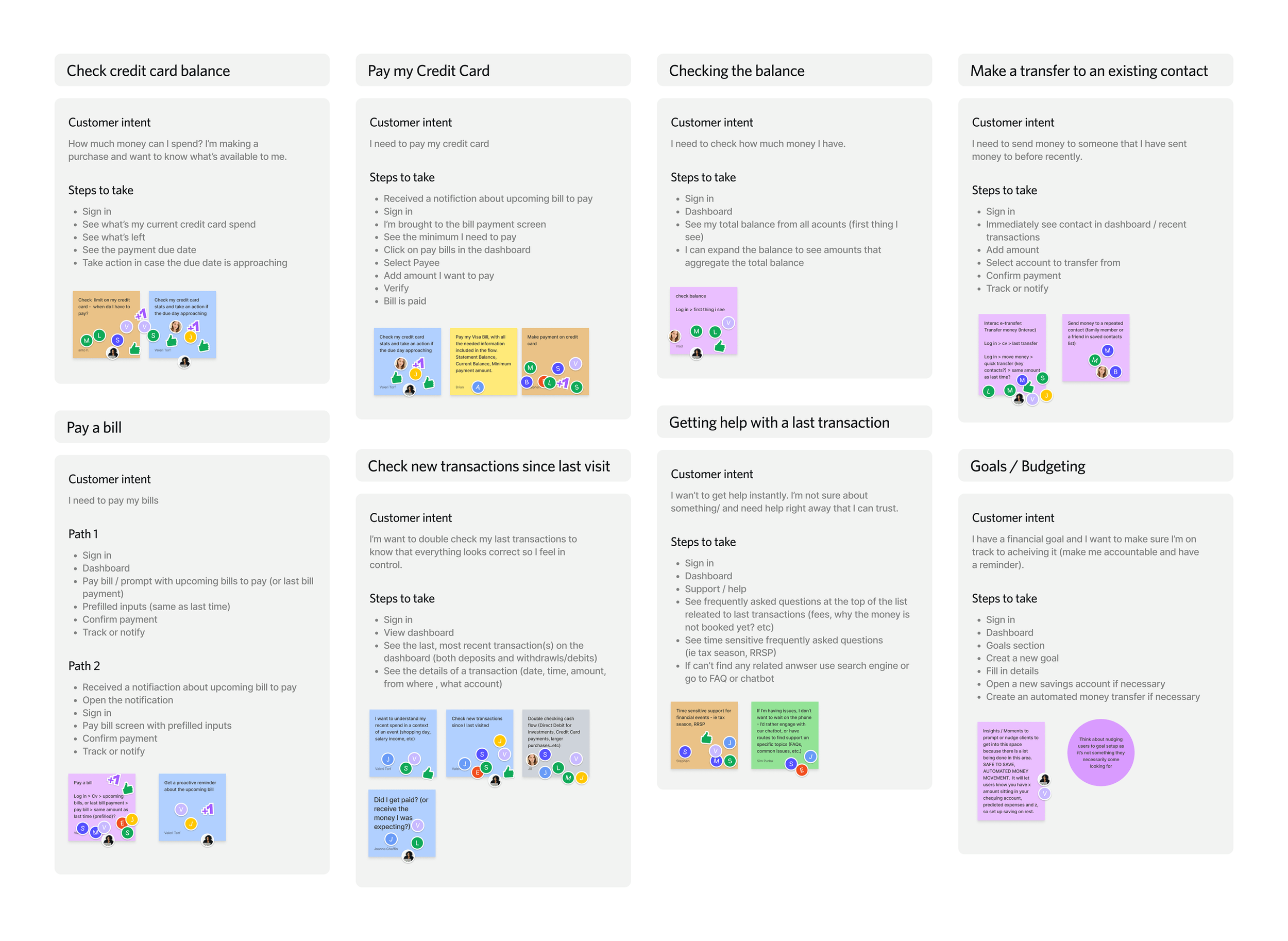
Defining the future state
With the delivery foundation in place, we aligned business, product, engineering, and design around core customer missions and priority outcomes. We mapped critical journeys and established a shared target experience to guide product decisions, platform investment, and system development across teams. Decisions were guided by customer research, usability testing, and journey analytics.
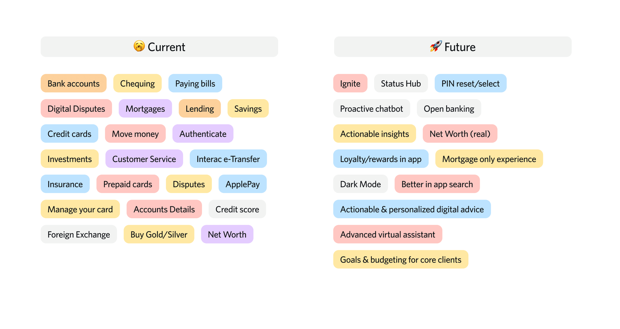
Testing the missions
We shifted from designing for generic users to designing around concrete customer missions. My team and I prioritized the high-stakes actions that matter most and validated them through three rounds of testing with new customers, ensuring the experience was intuitive and self-evident on first use.
Reframing navigation
We moved away from a hamburger menu that had become a dumping ground for features and content. Through design sprints, user testing, and clickstream analysis, we explored destination-based versus action-based navigation models and validated a structure that better matched how customers think about their financial tasks. Stakeholder reviews and research cycles ensured alignment across product and platform teams before committing to the new navigation approach.

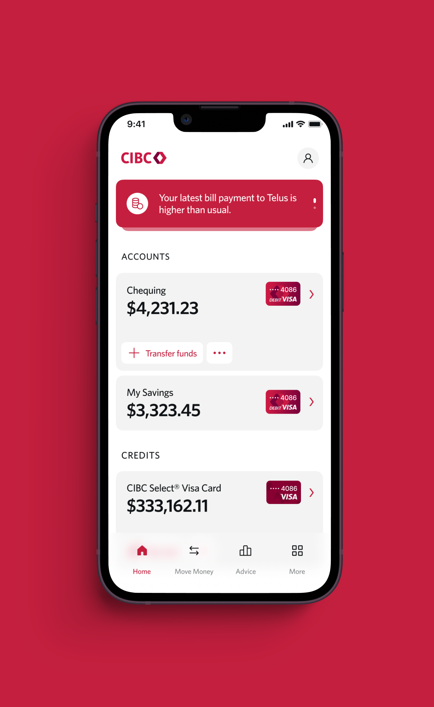
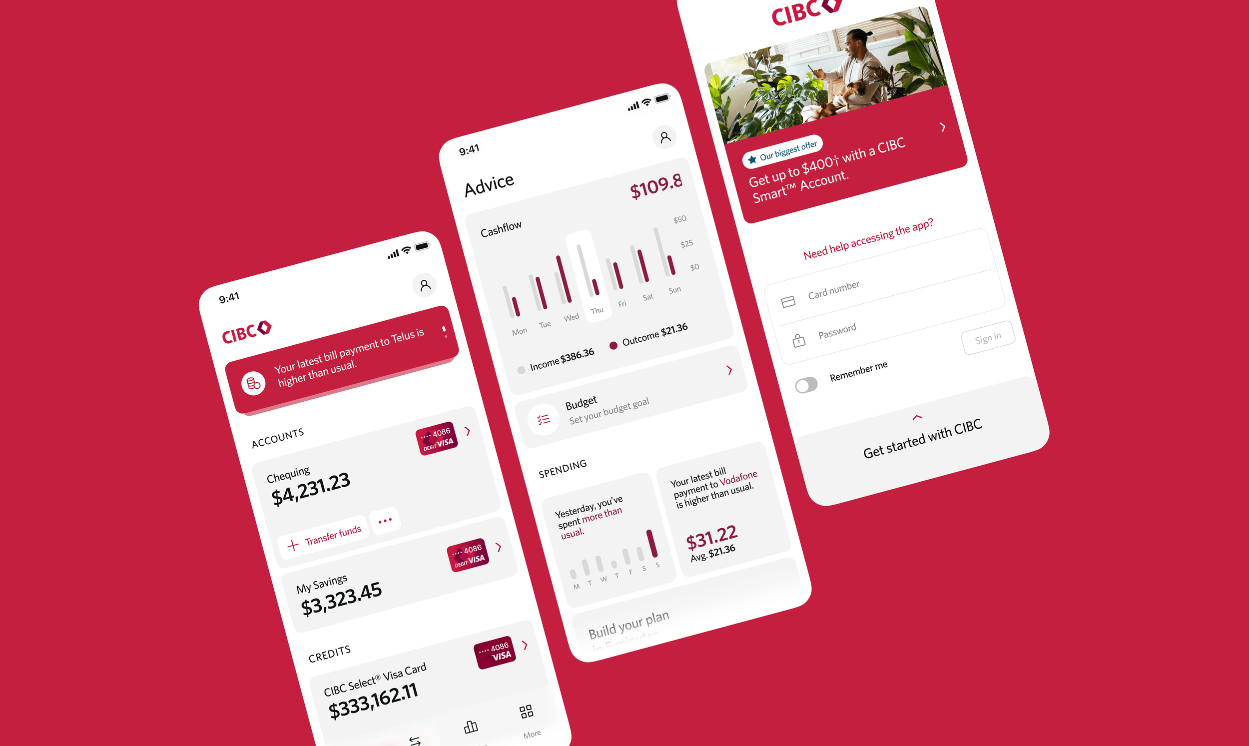
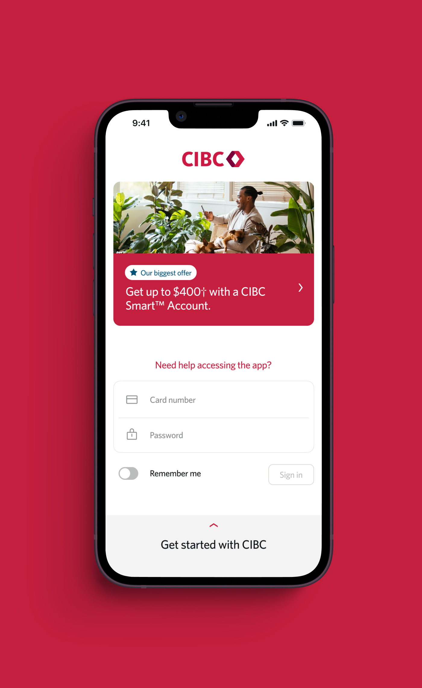
Design exploration
Working with a refreshed brand direction, we reimagined how CIBC shows up for its digital audience, focusing on clarity, confidence, and control. A series of design sprints, high-fidelity prototypes, research studies, and cross-team socialization allowed us to explore, test, and refine a modern experience before consolidating patterns and moving into scaled delivery.
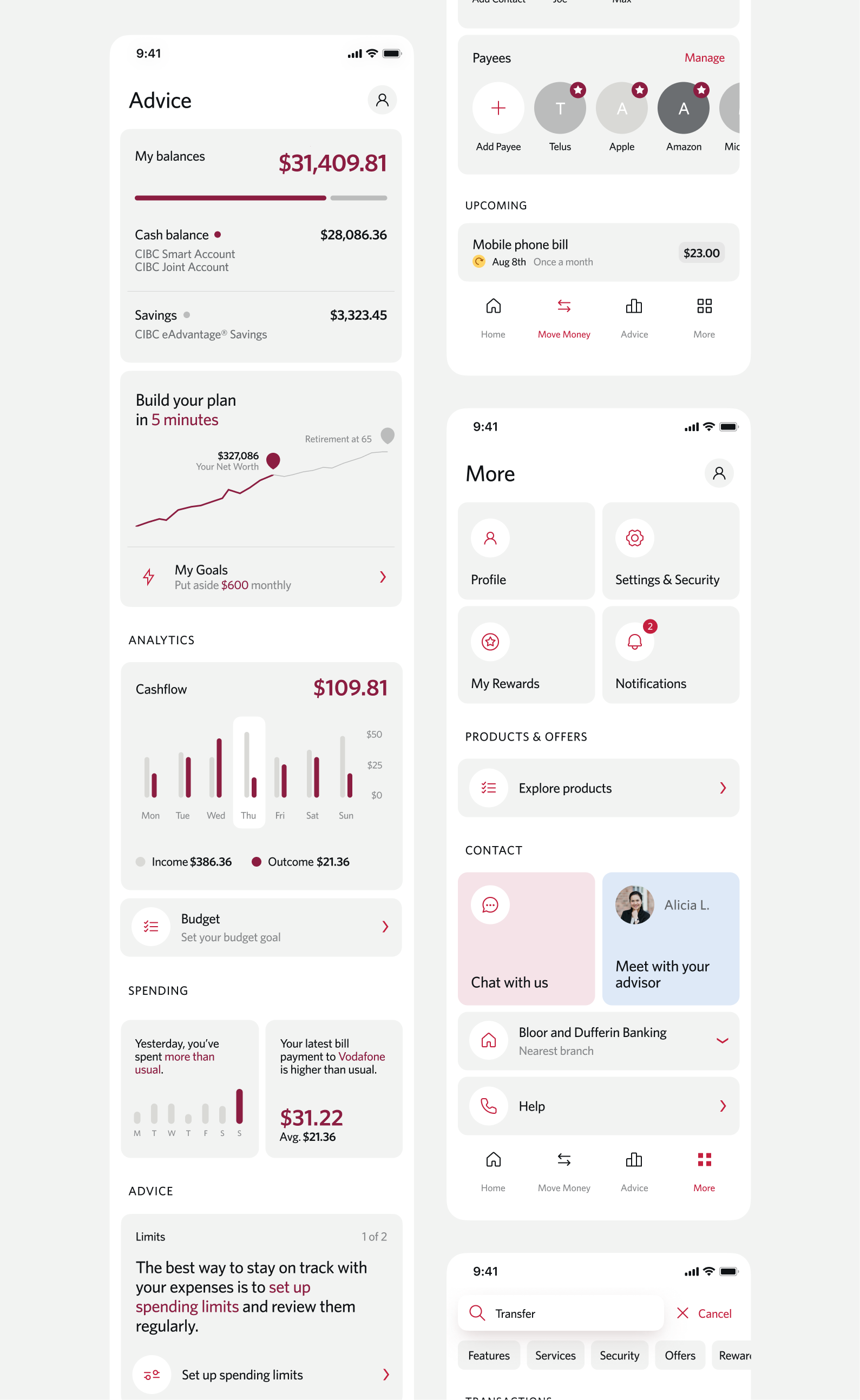

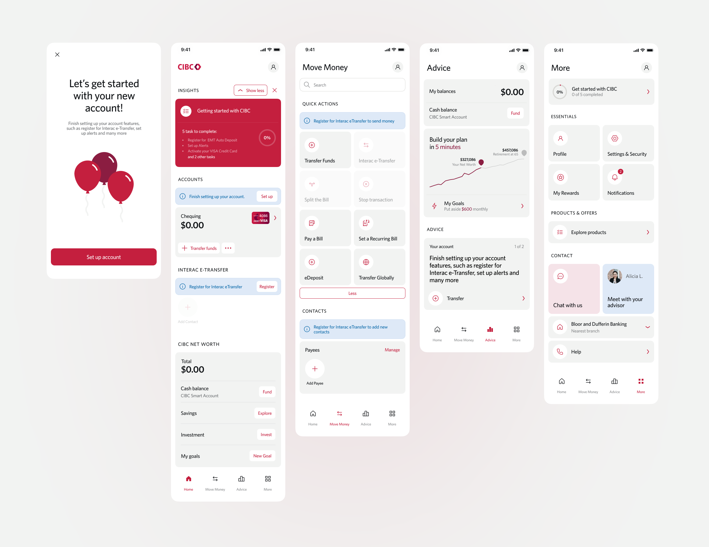
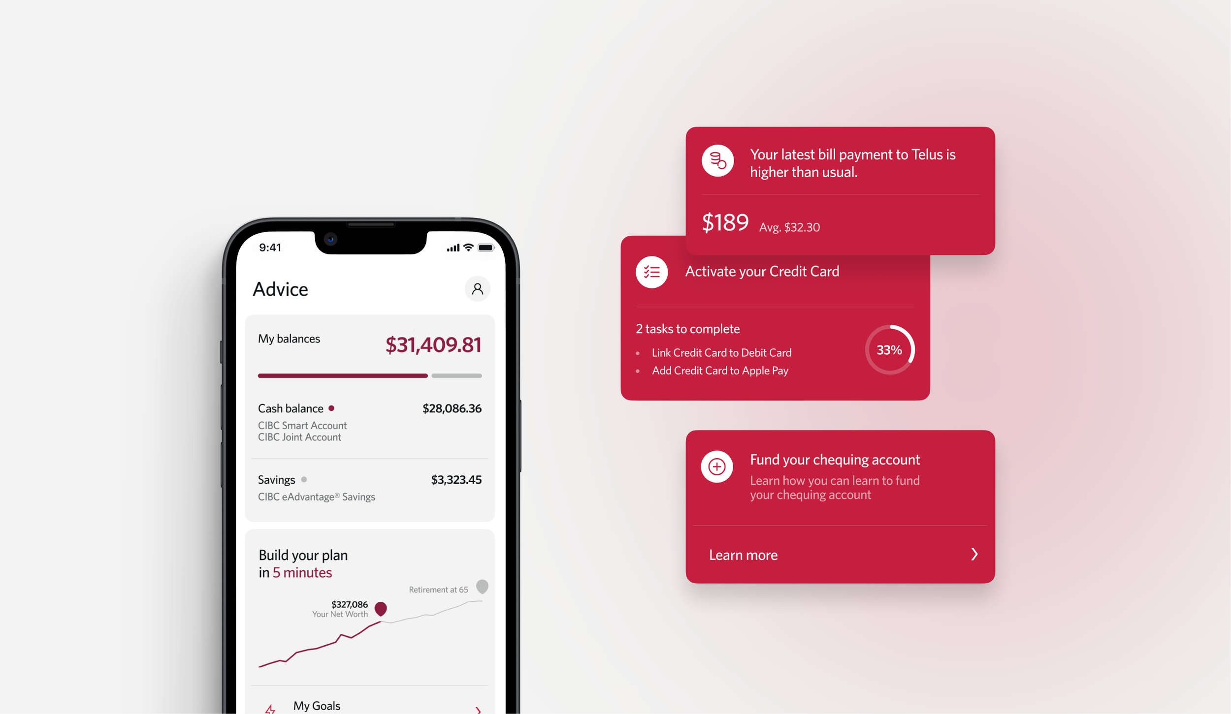
Building True North our enterprise design system
With the future experience defined and validated, the next challenge was delivering a modernized and consolidated experience consistently at scale. True North became our enterprise design system and delivery backbone. I led its development to equip more than 30 product teams with shared patterns, code-ready components, and clear contribution standards. This single source of truth removed UI guesswork, embedded accessibility by default, and ensured consistent experiences across platforms.


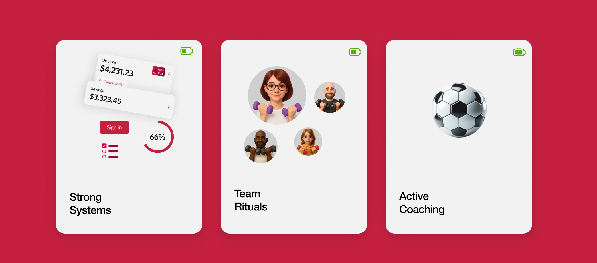
Scaling design beyond me
Adoption doesn't happen by accident, so I focused on building the infrastructure and culture that would let the work thrive without me in the room. I did this through strong systems, establishing a contribution model where every team had a voice in how True North evolved. I introduced team rituals like weekly design critiques and transparent review processes to turn the system into a living asset that people actually wanted to use. Through active coaching, I moved from being a sole decision-maker to a leader who empowered 30+ teams to take the wheel. This approach created a culture of shared ownership, and by the time we launched, we hit 100% adoption because the teams felt they owned the system as much as I did.
Turning a constraint into an opportunity
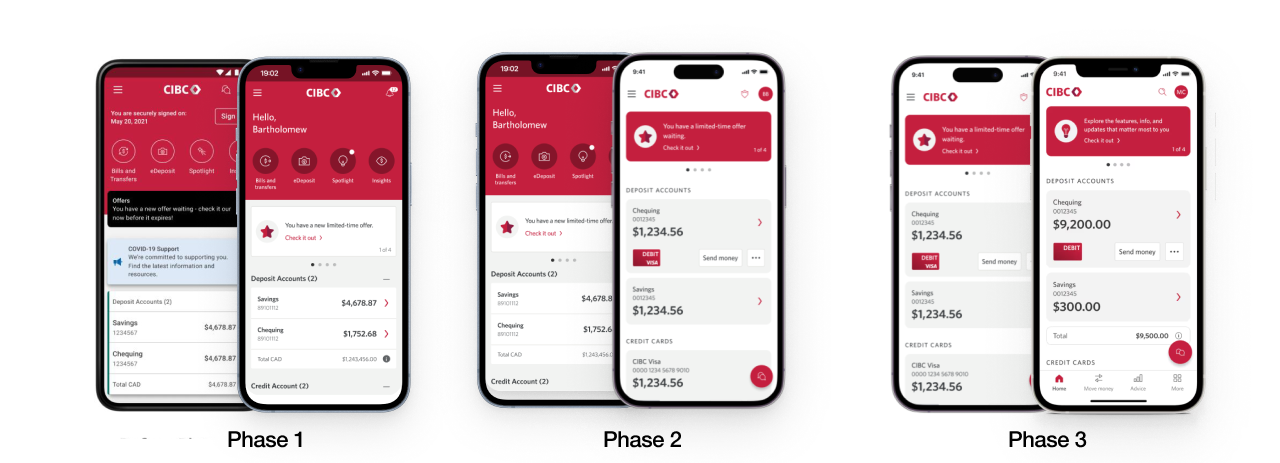
When funding conditions changed, we adapted how we delivered, not what we were aiming to achieve. I shifted the program from a single large-scale release to phased rollouts aligned to business priorities. This allowed teams to deliver high-impact features earlier, gather real-world usage data, and maintain stakeholder confidence while continuing toward the full target experience. The result was sustained momentum and quality without compromising the long-term vision.
Phase 1
Test & Learn
217% Increase in ghost ads & offers
43% Increase with insights
10% Build velocity
Phase 2
Change Management
+64% Send Money
+5% Transfer Funds
+18% Bill Payments
20% Build Velocity
Phase 3
Lower Navigation
+274% Offers
+162% Explore Products
+54% Help Centre
33% Build Velocity
Results & impact
Over a multi-year transformation, we successfully modernized and consolidated CIBC’s digital banking experience, delivering higher quality experiences that better meet clients where they need us. Engagement and NPS reached record levels, key conversion flows improved, and product teams increased delivery velocity by 33%. At the same time, we established the systems, operations, and delivery foundations required to sustain quality and consistency at scale. The program reduced design and technology debt while establishing a repeatable model for delivering modern digital products across a complex enterprise ecosystem.
Customer engagement
Homepage impressions grew from 10.4M to 33.7M per month
Personalized content increased repeat visits and exploration
Chatbot adoption accelerated as customers shifted to digital self-service
Transaction & self-service outcomes
Everyday mobile transactions reached record highs
Send money and bill payment flows increased across priority journeys
Credit card self-service interactions expanded
Digital self-service containment improved across key tasks
Conversion & business performance
Offers and product exploration click-through increased by 217 percent
Cross-sell and ghost account interactions increased by 274 percent
Key conversion flows improved across priority journeys
Operational & delivery impact
Delivery velocity increased by 33 percent
Shared patterns and components reduced duplicate build effort
Design and engineering teams aligned on common standards
True North adopted 100% across more than 30 product teams
Accessibility & personalization
100 percent WCAG compliance embedded in core components
Natural thumb-zone placement improved usability
Personalized financial snapshots increased content relevance
Continue browsing most recent work.