
Therefore Interactive
Building the Brand OS: How I reimagined Therefore’s identity to drive clarity, credibility, & growth.
My Role
Executive Creative Director & Lead Designer: Led brand vision & design, research, design reviews & execution, stakeholder communications
Team Size
12 Humans (Design, Research, Content, Development, Ops)
Tools Used
Figma, Jira, Confluence, Adobe CC, Maze, Medallia,

Therefore had the technical power but lacked a brand story that matched its ambition. I partnered with the CEO to uncover a more human narrative and move the agency away from a generic identity that the team struggled to define. I turned those insights into a brand system that balanced credibility with a distinct voice, focused on real world tools like pitch decks and client touchpoints. By building the right guidelines, I empowered the team to own the story and keep the brand consistent as the business grew.


Finding the story.
I started by focusing on what Therefore did best: technology and strategic execution. What was missing was a sense of story and expression, something that could make the brand memorable. I worked with the CEO and the team in creative workshops to uncover a direction that balanced those strengths with a more human narrative. My role was to shape that input into a clear vision and give the team direction they could believe in and build from.

A visual language built to scale.
The new visual language introduced a confident type system, an approachable color palette, and a clear hierarchy that guided attention with purpose. I designed flexible layouts that could shift from precise and analytical to more open and expressive, reflecting the dual nature of Therefore’s work. Beyond visuals, we established a brand language that could scale across every channel and communication, ensuring consistency from the website to pitch decks to client conversations.


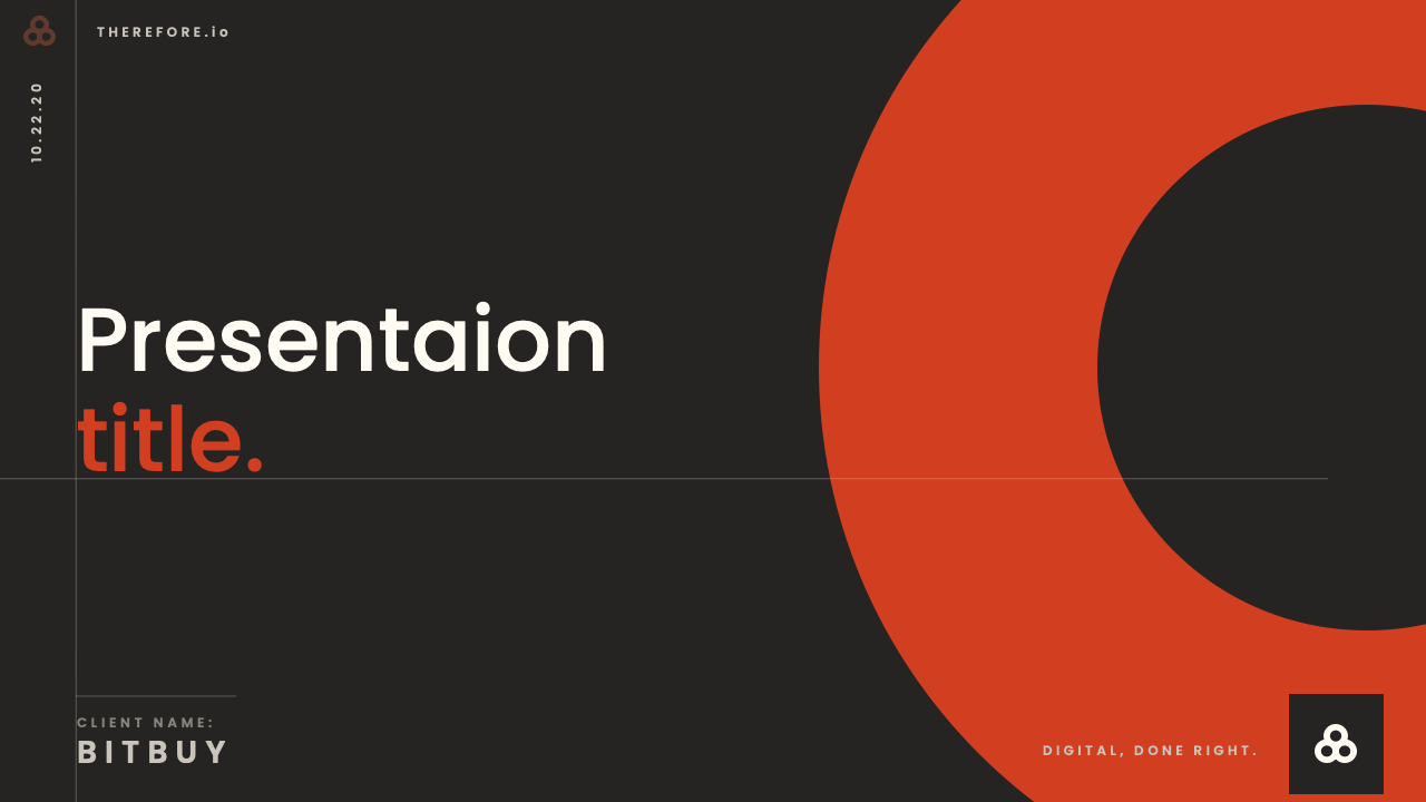
Where the brand lives.
Every decision was built around activation. I made sure the brand showed up where the business actually lives: in decks, documents, and real conversations with clients. The result was a brand that not only looked better but also worked better in the moments that mattered most.
Built from the inside out.
This project reinforced my belief that the most effective brands are built from the inside out. By turning the brand into a system that empowers teams and reflects the company’s evolving identity, I helped Therefore align its visual voice with its strategic ambition. It is no longer just a brand, it has become an engine for clarity, credibility, and growth.

Results & impact
The rebrand gave Therefore a stronger voice in the market and a clearer story to tell. The new identity made the agency more memorable in pitches, easier for clients to understand, and more consistent across every touchpoint. The scalable design system reduced design debt and streamlined production, while the Jamstack build delivered a site that was faster and more reliable. Most importantly, the team gained confidence in how they spoke about themselves, with a brand that matched both their capabilities and their ambition.
Continue browsing most recent work.