
CIBC Redesign
Transforming CIBC's secured banking platforms and building an enterprise design system that scaled across 30+ teams
My Role
Design Director — Led product vision, research strategy, design execution, & stakeholder alignment across business, product, & technology.
Team Size
22 people (Design, Research, Content, DesignOps) + 30+ product teams across CIBC.
Tools Used
Figma, Jira, Confluence, Adobe CC, UserTesting.com, Medallia, Tableau
When I joined CIBC, the digital experience was a 15-year-old legacy mess that had fallen behind both the brand and our users. To fix this, we didn't just redesign screens; we overhauled the entire delivery ecosystem. My team and I defined a future-state vision for digital banking and built the True North design system and a Design Ops practice from the ground up to get 30+ teams moving in sync. By replacing fragmented, platform-specific builds with a unified strategy backed by real evidence, we transformed design into a massive business driver, hitting record NPS scores, spiking conversions, and increasing delivery speed by 33%.
Strategy & discovery
We started by tearing down our existing business model and mapping it against the market. Using a Lean Canvas and deep competitive analysis, we identified where our strategy was failing our users. We didn’t just look at what we currently offered; we identified new services to drive growth and moved away from "the way we've always done it" to set a clear direction for the future
Testing the missions
We stopped designing for "users" in the abstract and started designing for specific missions. My team and I narrowed down the endless list of tasks to the high-stakes actions that actually matter to our customers. We benchmarked these scenarios through three rounds of testing with newcomers, ensuring the new experience was intuitive enough to pass the "first-time" test without a manual.
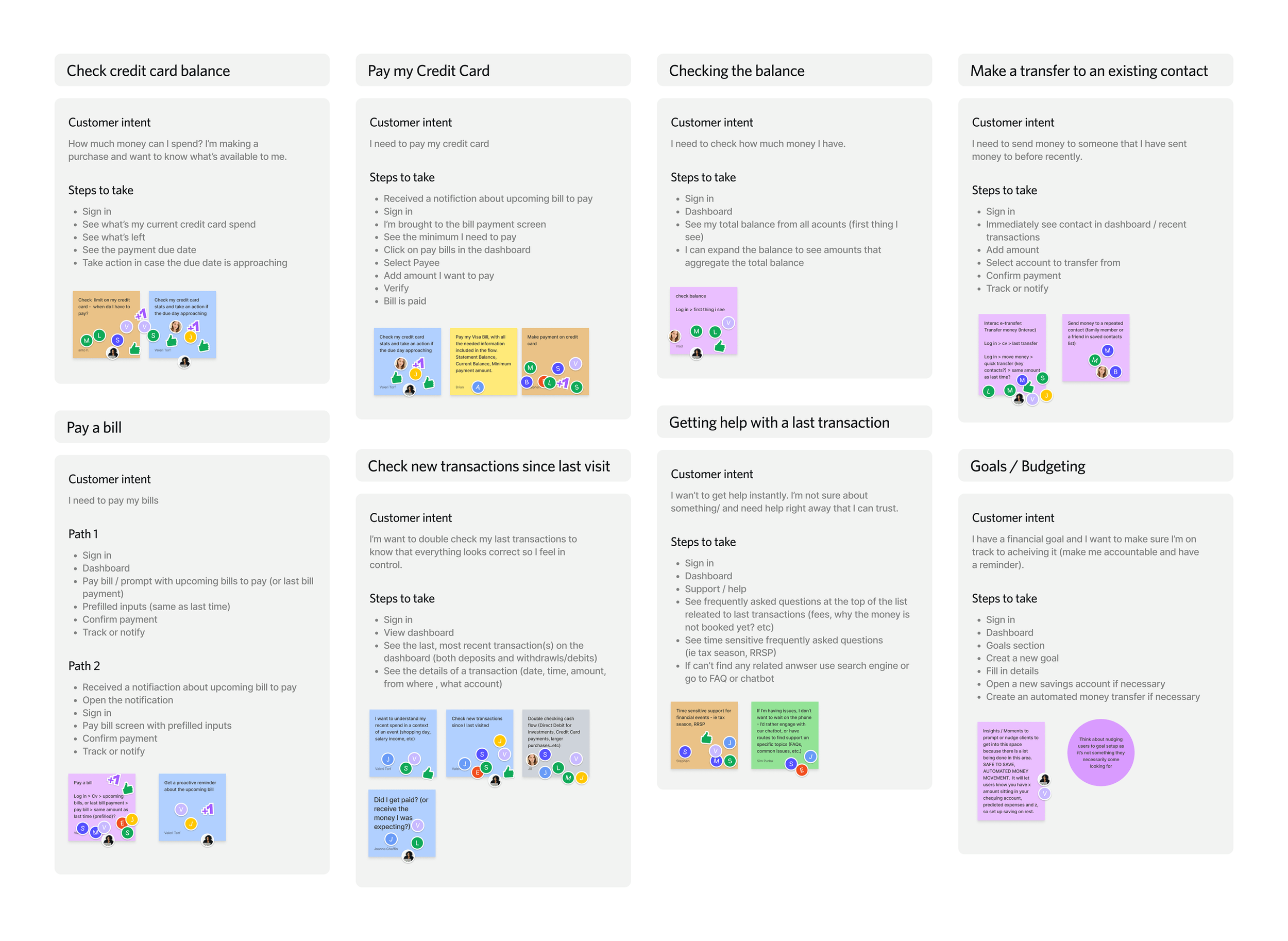
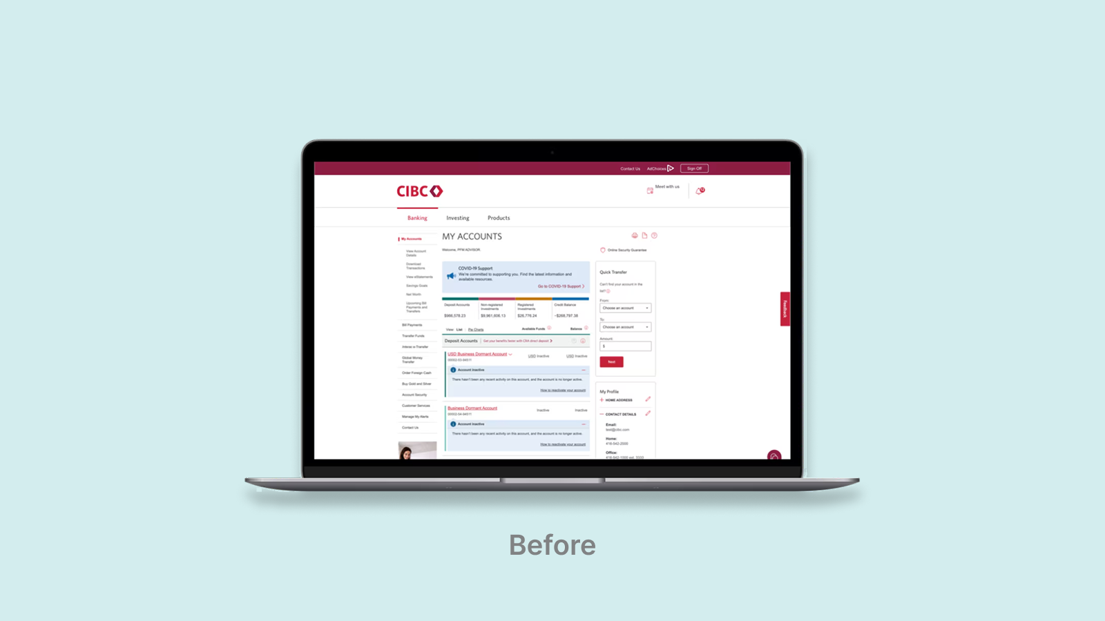
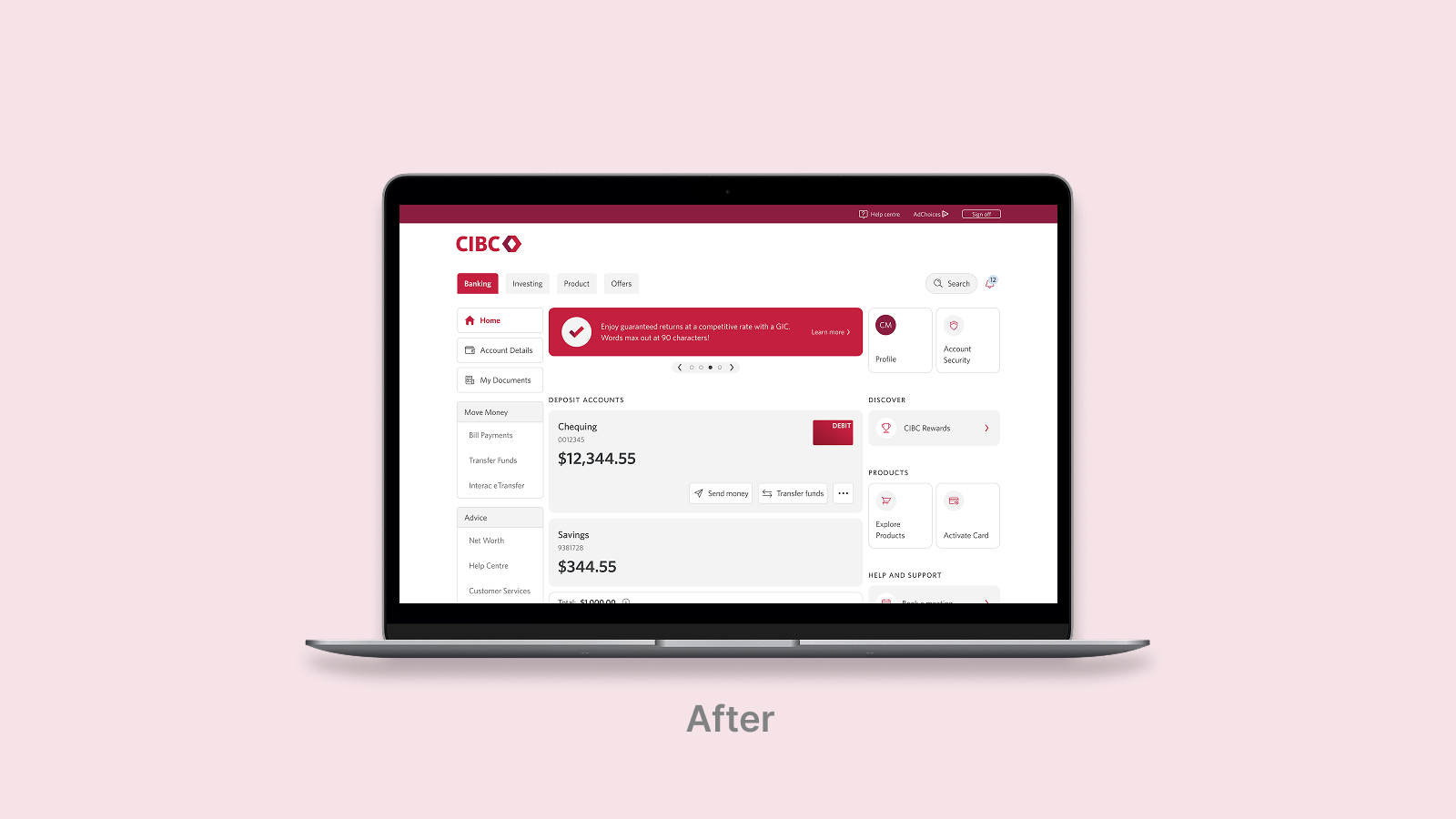
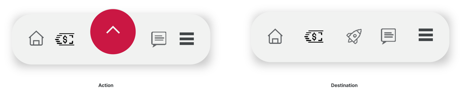
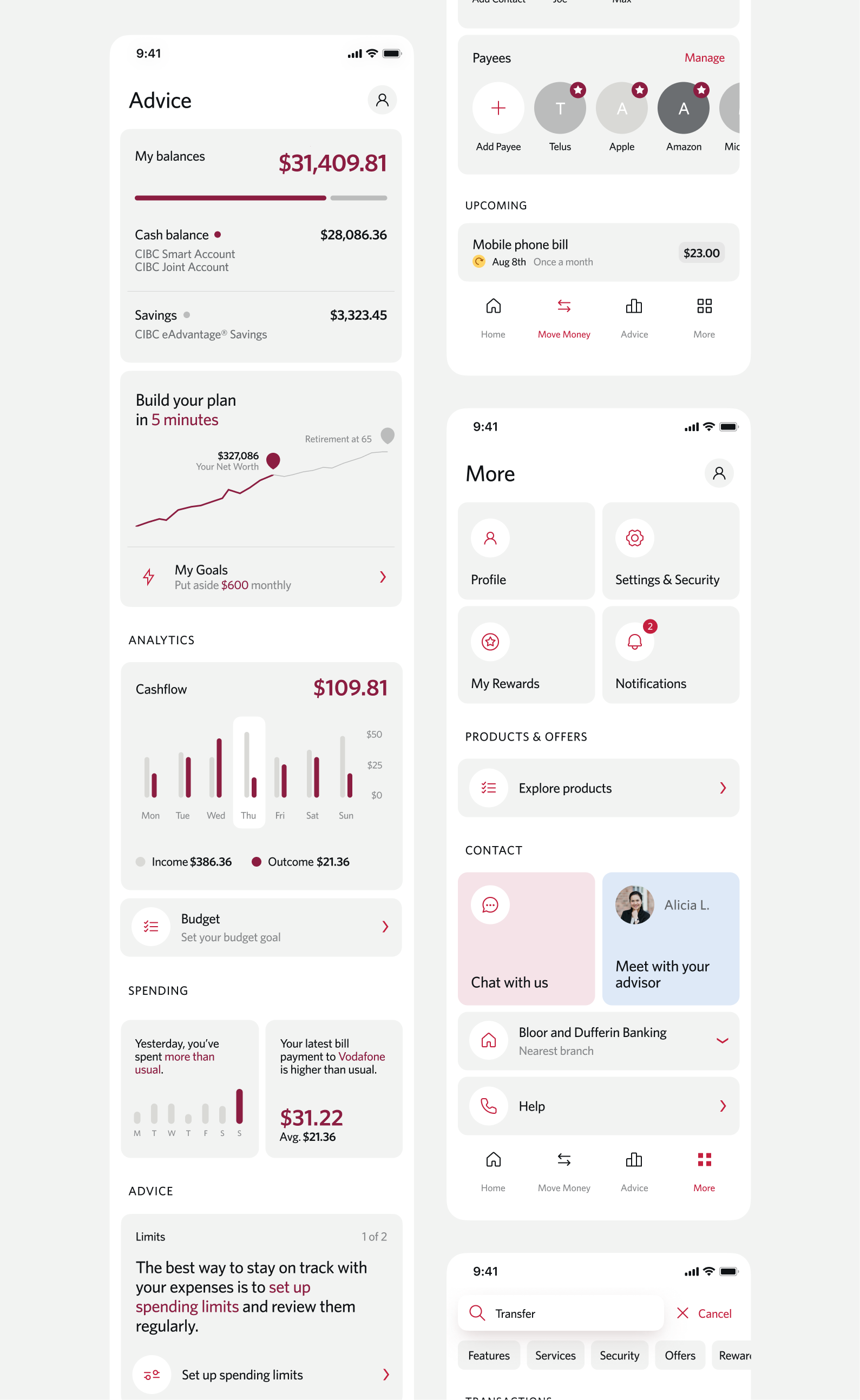
Dashboard & navigation
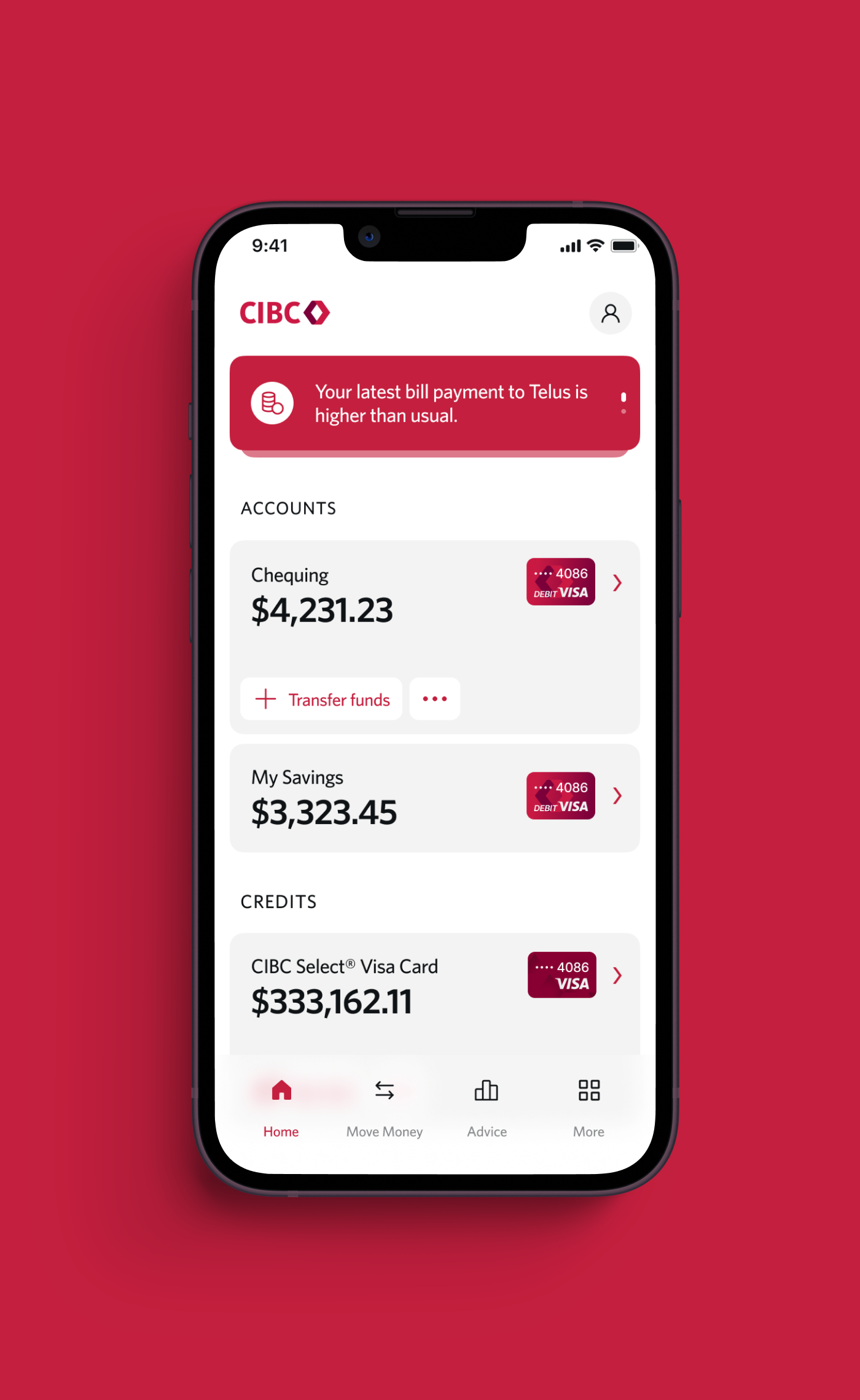
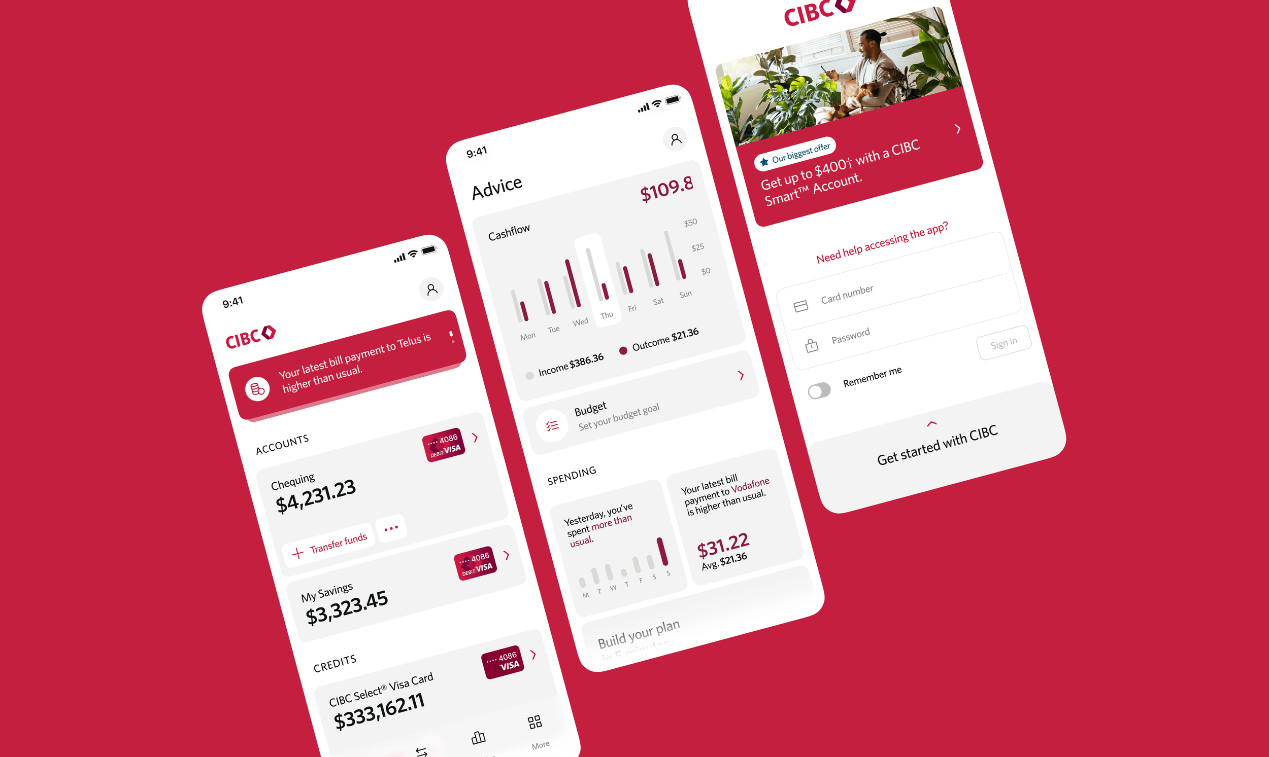
The old app was a "hamburger menu" junk drawer where features went to die. We blew that up in favor of a destination-based navigation model that actually makes sense: Home, Move Money, Advice, and More. One-click testing confirmed this was the fastest way for people to get in and out. We then overhauled the dashboard to prioritize a personalized "Net Worth" view and visual card identification, turning a cold list of accounts into a meaningful financial snapshot.

Building True North our enterprise design system
True North wasn’t just a UI kit; it was the engine we built to power the entire bank. I led the development of this system to provide 30+ teams with a unified library of code-ready components and shared patterns. By creating this single source of truth, we finally killed the UI guesswork. This infrastructure didn't just align our visuals, it became a high-velocity delivery tool that boosted shipping speed by 33% and guaranteed 100% WCAG compliance by baking accessibility directly into every component.


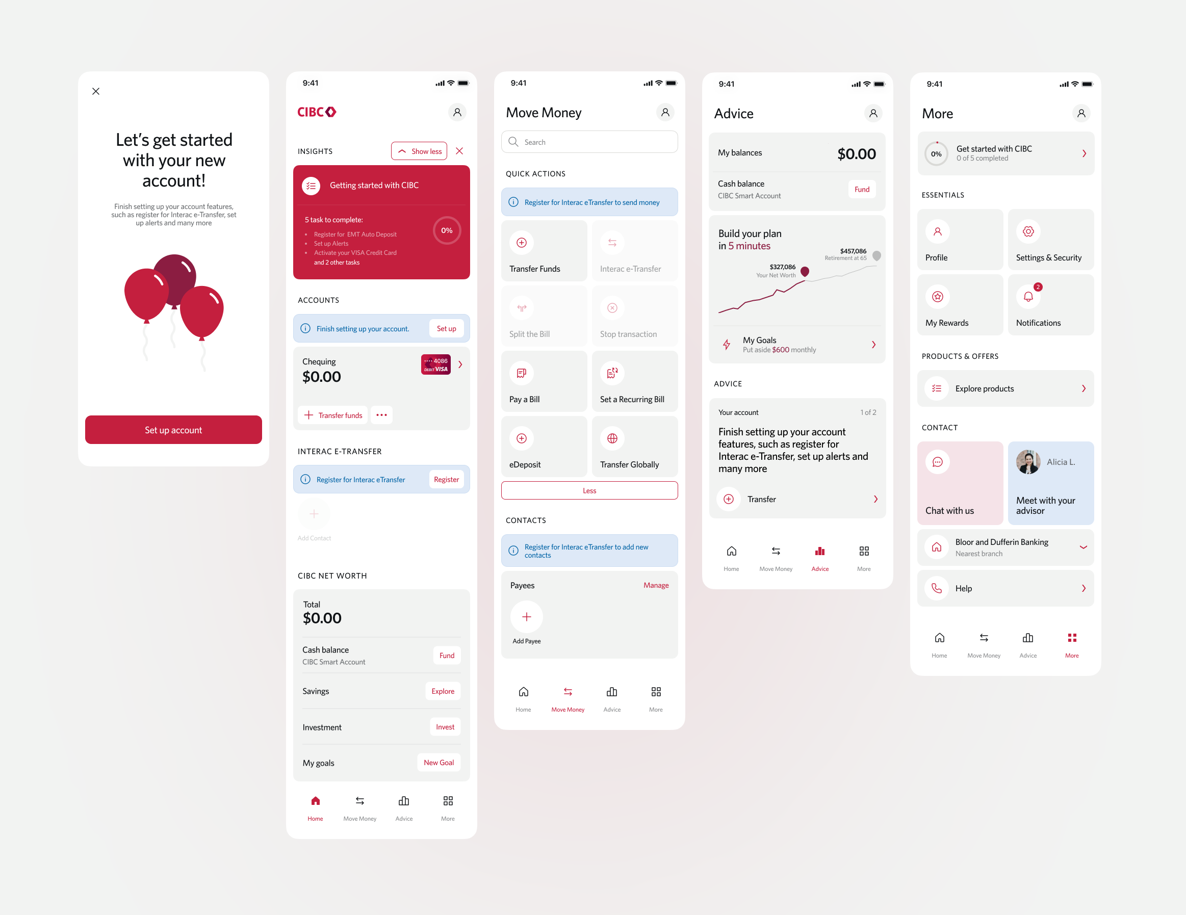
Scaling design beyond me
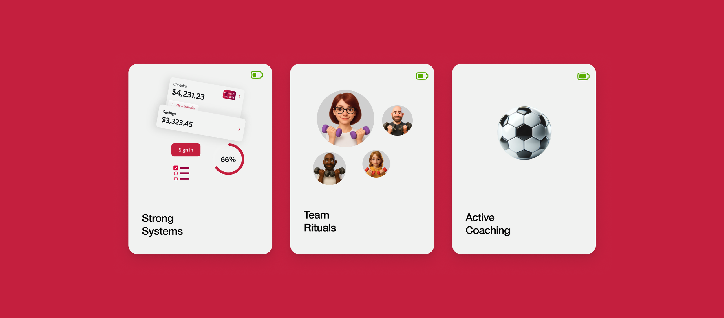
Adoption doesn't happen by accident, so I focused on building the infrastructure and culture that would let the work thrive without me in the room. I did this through strong systems, establishing a contribution model where every team had a voice in how True North evolved. I introduced team rituals like weekly design critiques and transparent review processes to turn the system into a living asset that people actually wanted to use. Through active coaching, I moved from being a sole decision-maker to a leader who empowered 30+ teams to take the wheel. This approach created a culture of shared ownership, and by the time we launched, we hit 100% adoption because the teams felt they owned the system as much as I did.
Turning a constraint into an opportunity
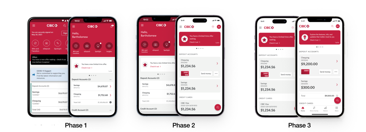
When the funding landscape shifted, we didn't scale back our ambition; we just changed our strategy. I pivoted the team from a single "big bang" launch to a phased rollout that mapped directly to business priorities. This approach allowed us to ship high-impact features early, gather real-world data, and prove our value to stakeholders at every step. By breaking the vision into manageable delivery packages, we maintained our momentum and quality without ever compromising the end goal.
Test &
Learn
Phase 1
217% Increase in ghost ads & offers
43% Increase with insights
10% Build velocity
Change
Management
Phase 2
+64% Send Money
+5% Transfer Funds
+18% Bill Payments
20% Build Velocity
Lower
Navigation
Phase 3.
+274% Offers
+162% Explore Products
+54% Help Centre
33% Build Velocity
Results & impact
User feedback indicated that the new layout felt intuitive as it mirrors patterns seen in other top banking apps.
Increased engagement post-homepage redesign, with key content impressions growing from 10.4M to 33.7M per month.
Transaction efficiency gains, such as a 1.92pp increase in everyday mobile transactions and a 12-month high for eTransfers at 58.8% usage rate.
Self-service containment improvements, including a 5% rise in credit card management interactions (e.g., card locking and lost card reporting).
Enhanced chatbot adoption, with usage in the first three months post-launch equaling the total volume seen in the preceding seven months.
Sales conversion improvements, with click-through rates for redesigned “Ghost Account” features increasing by 217%.
Enhanced accessibility by placing high-usage features within the natural thumb zone.
Improved client engagement through intuitive design and increased personalization.
Driven higher conversion rates, especially in key financial transactions and product discovery.
Positioned CIBC competitively, as many leading banks had already adopted this pattern.
Continue browsing most recent work.